On The Stage
Designing a stage where creativity and community shine
Client:
On The Stage
Year:
2023
Type:
Art Direction
,
Branding
,
UX/UI
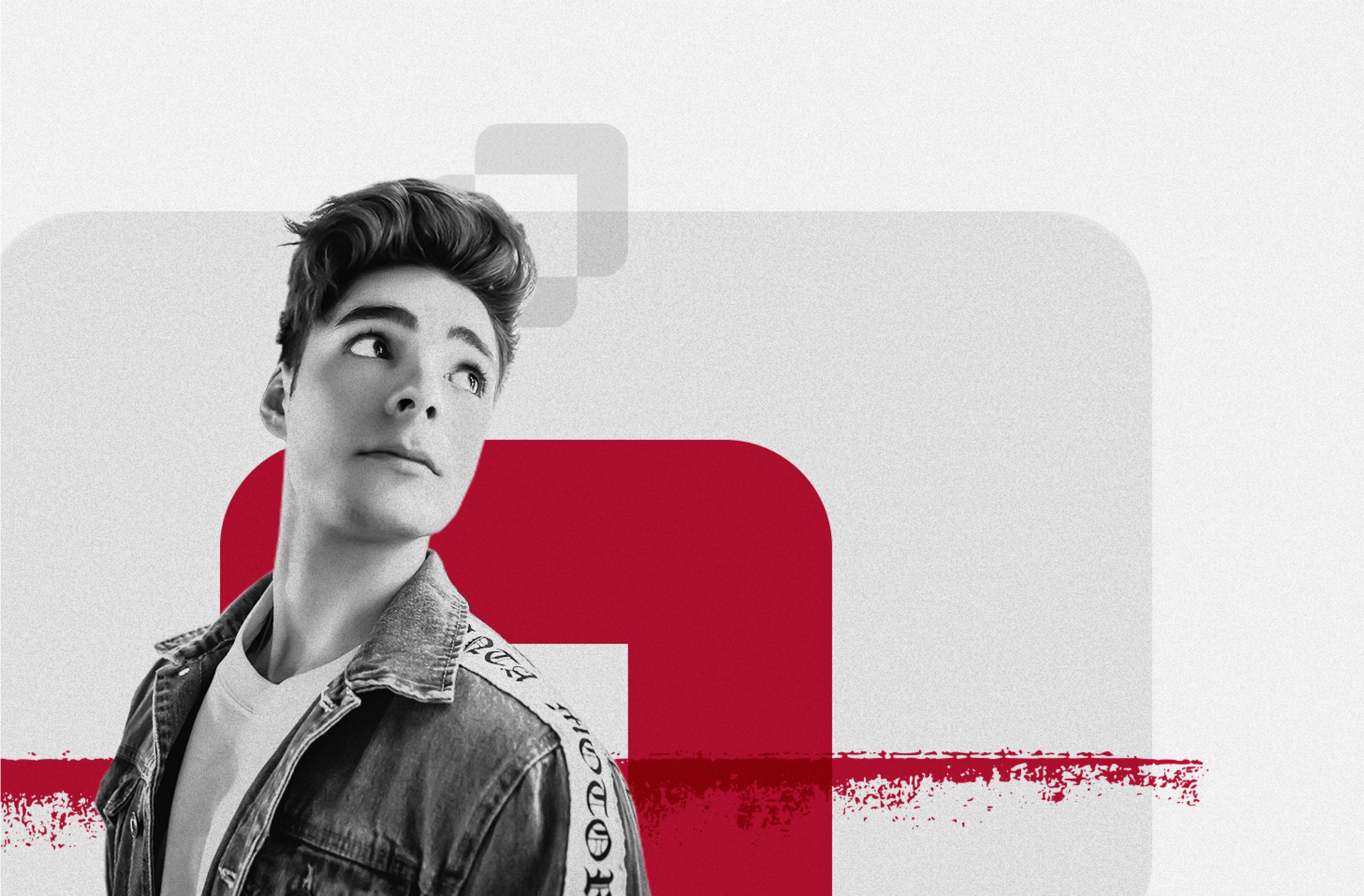
Design that honors creativity and inspires engagement.

Overview
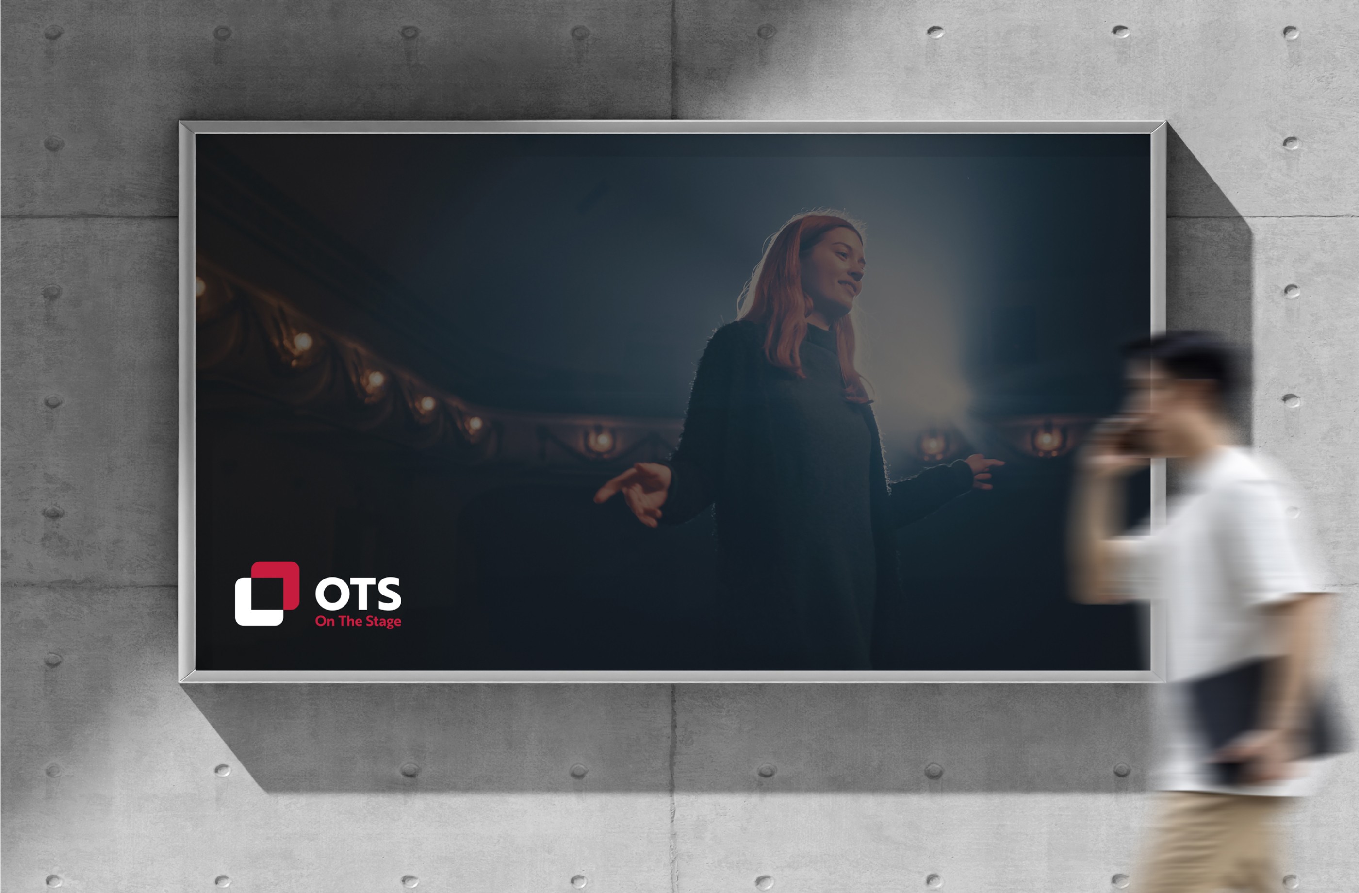
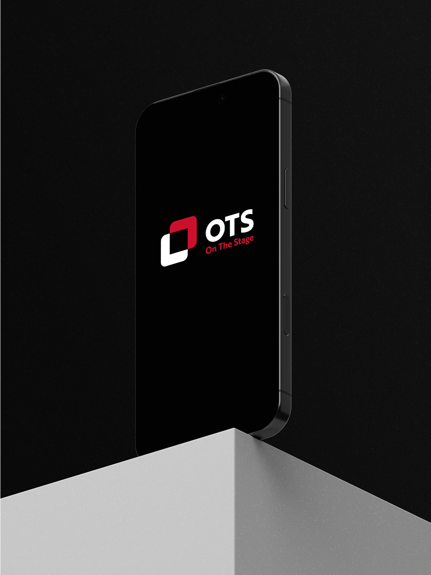
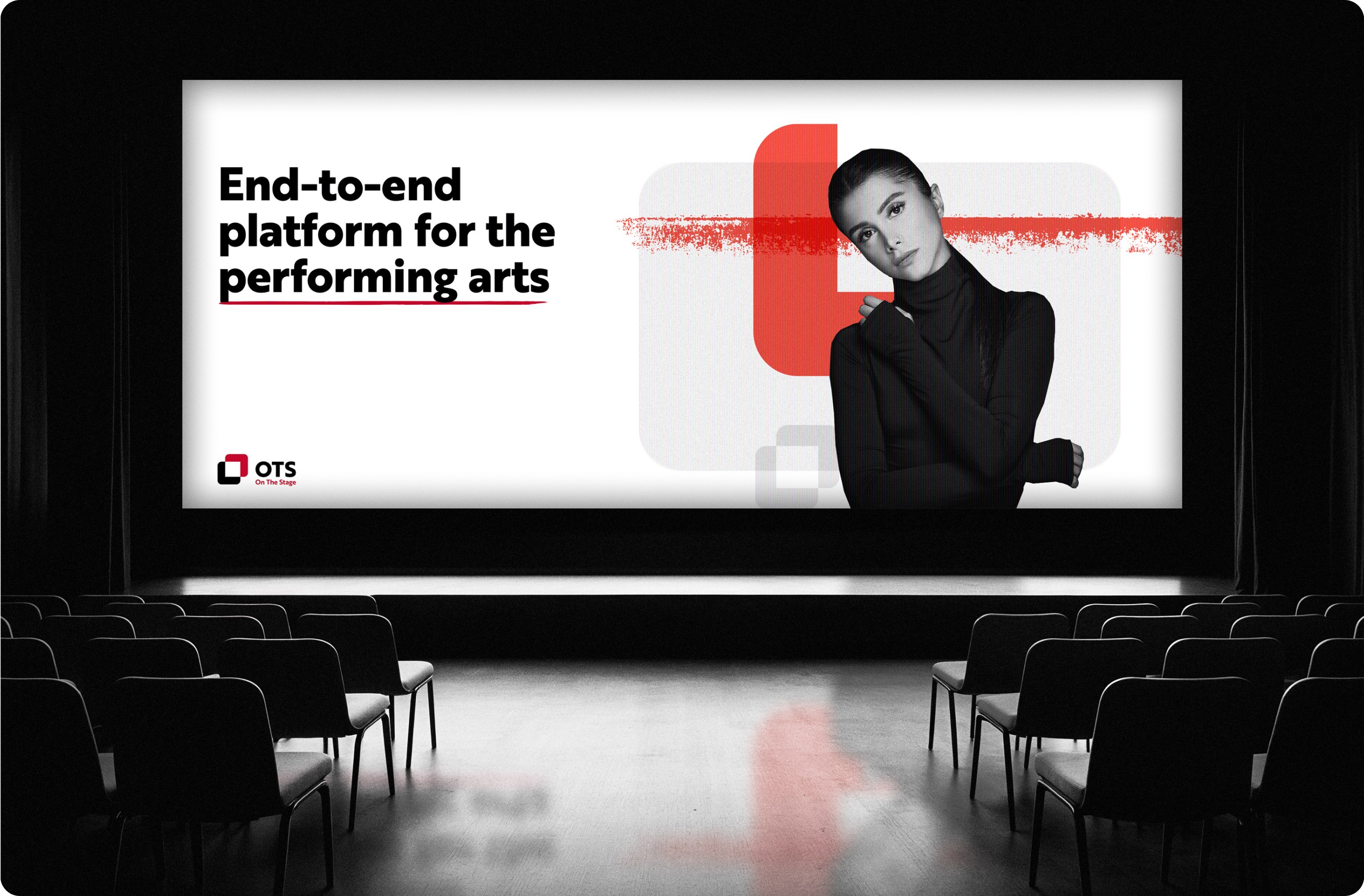
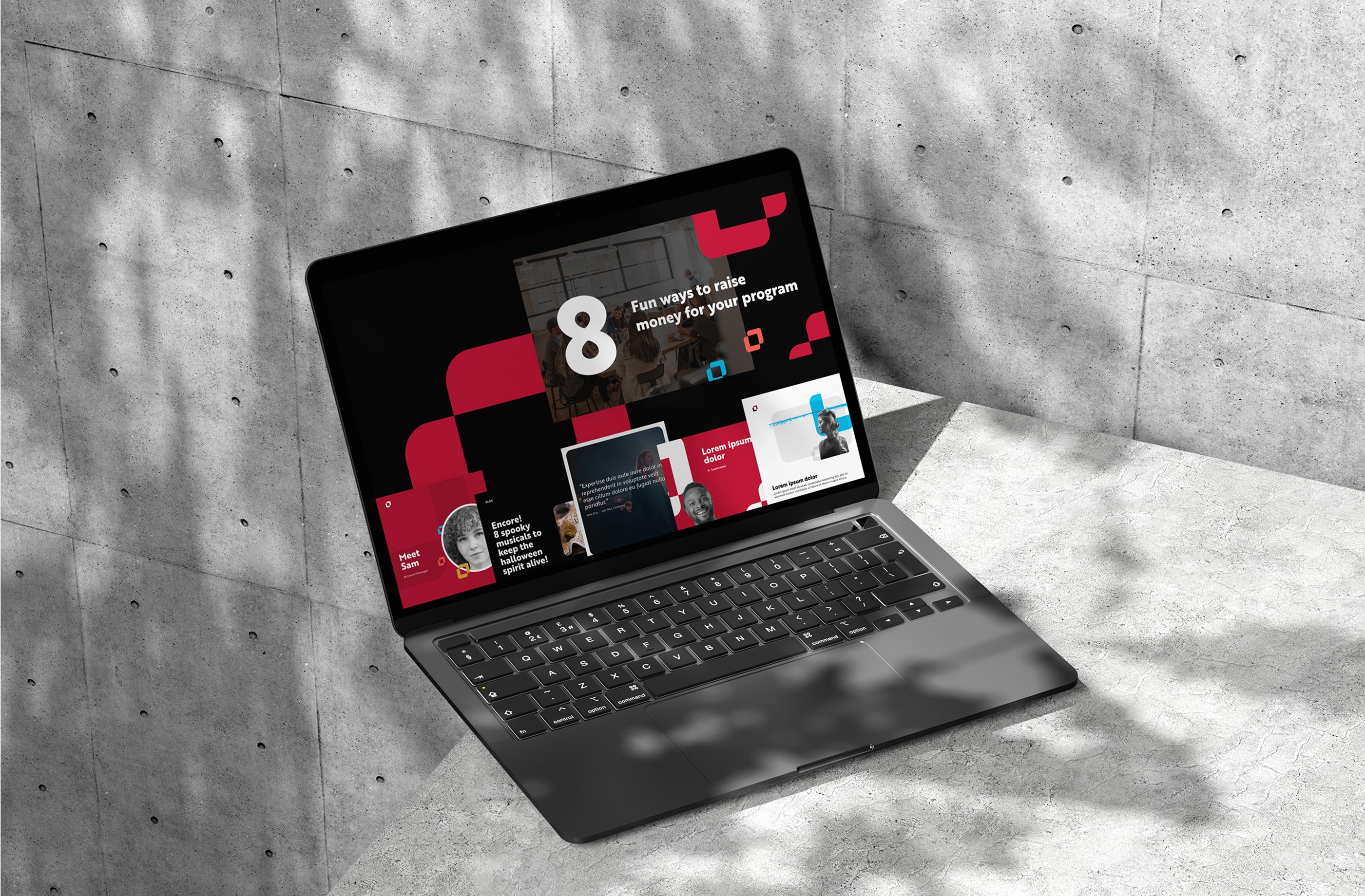
On the Stage is an integrated software suite that gives performing arts organizations the tools to market shows, sell tickets, and raise funds. As lead designer at HUSL Digital, I created a new brand identity and website, working with a HUSL copywriter on the messaging.
20 → 55 pages
12 page templates
45 components
4 product categories, 27 tools


Challenge
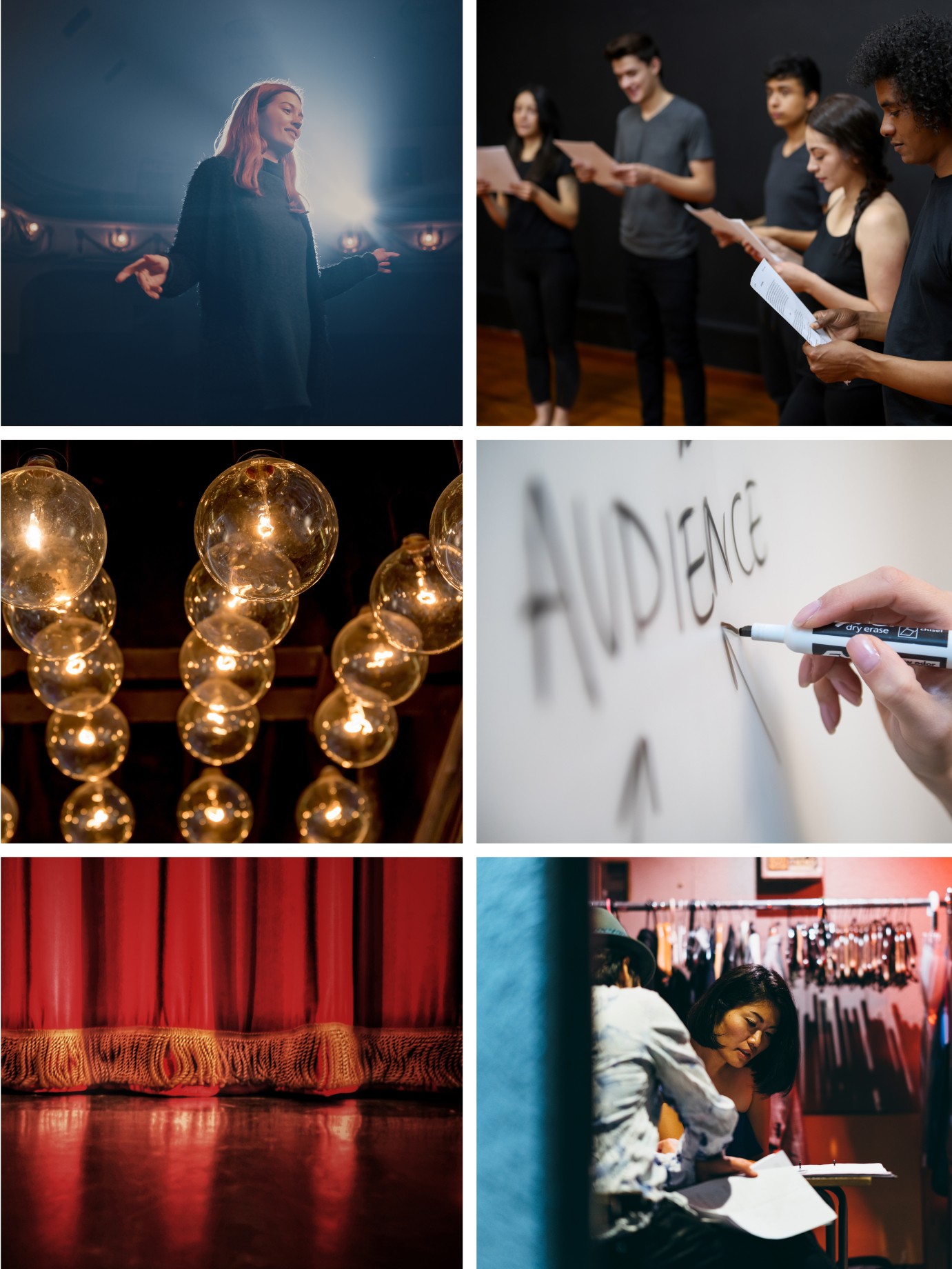
On the Stage's brand was youthful in a way that didn't fit the professionals it served, and it wasn't connecting with the arts organizations it wanted to reach. The company also had a lot to explain: a suite of 27 tools across four categories (Marketing & Promotions, Booking & Box Office, Fundraising, and Revenue Accelerators), for organizations that [directors, administrators, and fundraisers, confirm].
The redesign needed to unify the messaging, give the brand a new identity, and build a flexible system that reflected the creativity of the theatre community while positioning On the Stage as a trusted, forward-thinking partner.
Solution
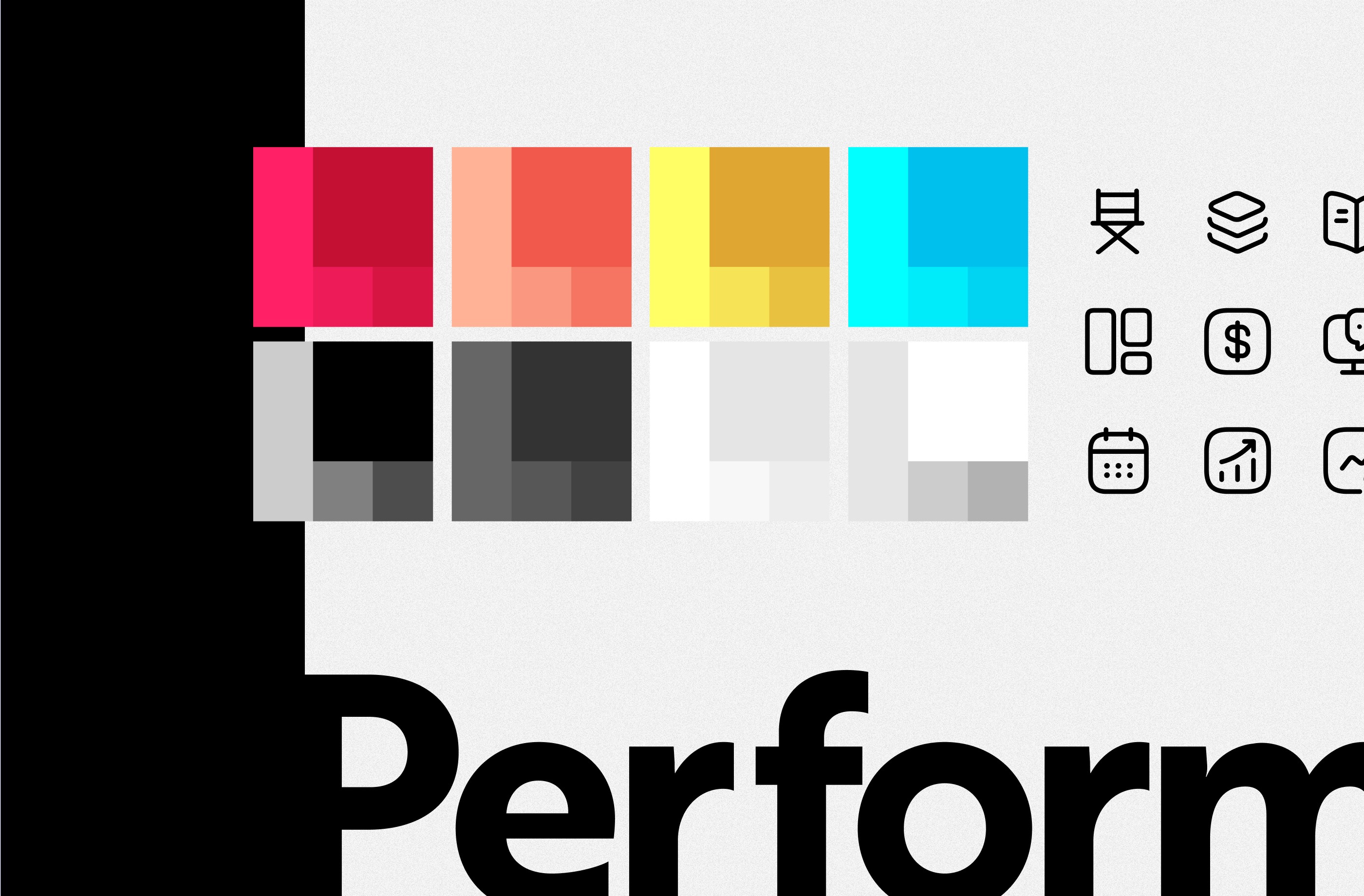
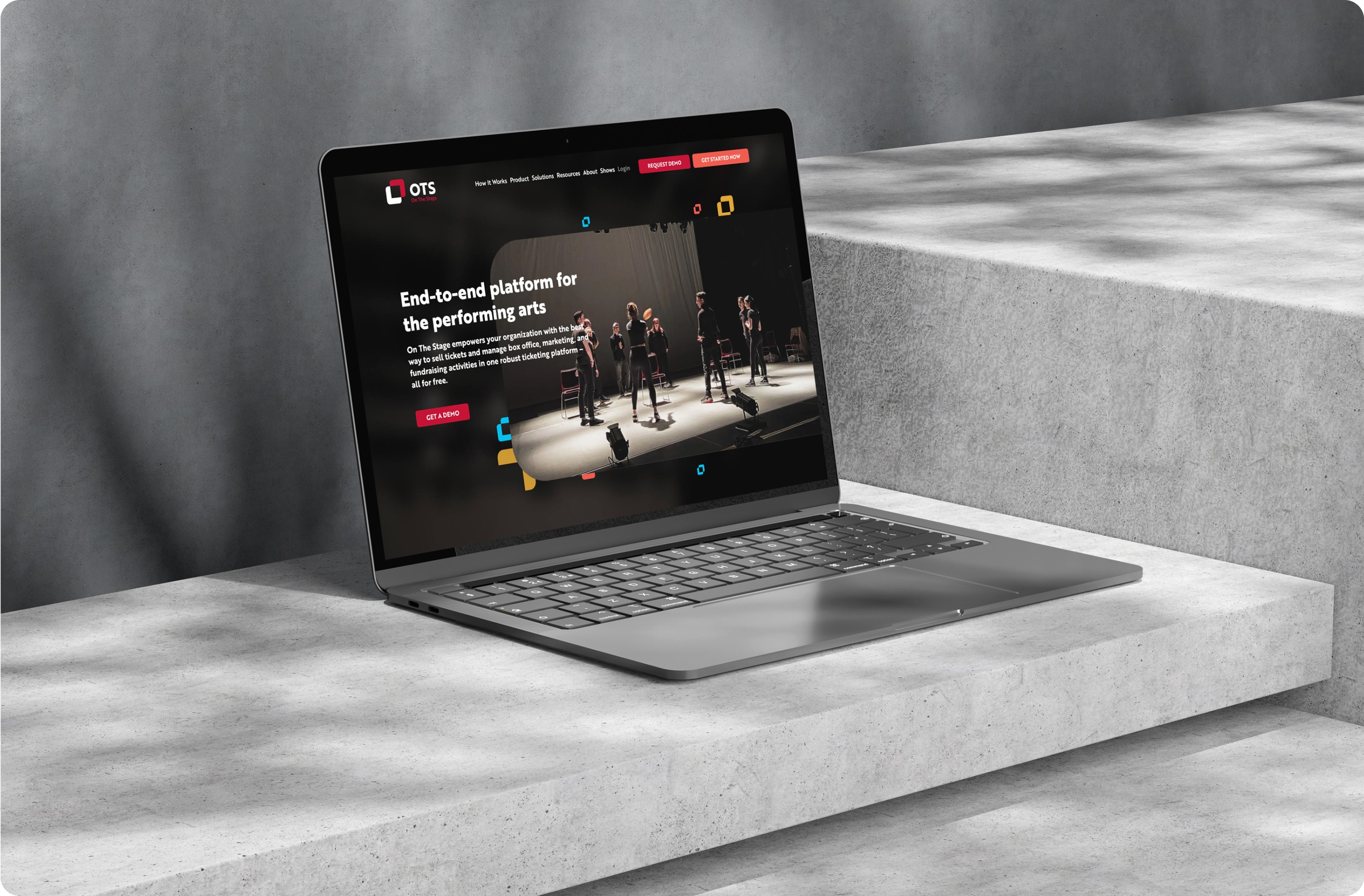
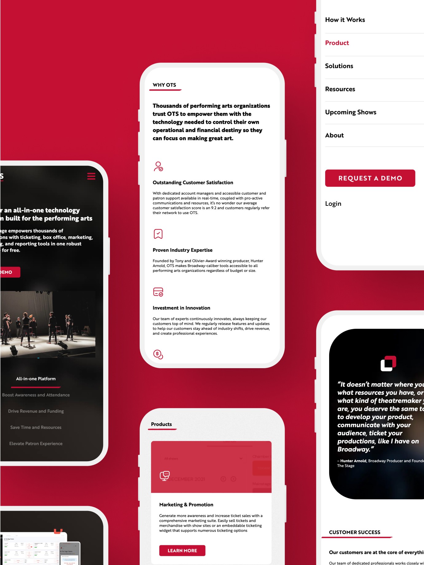
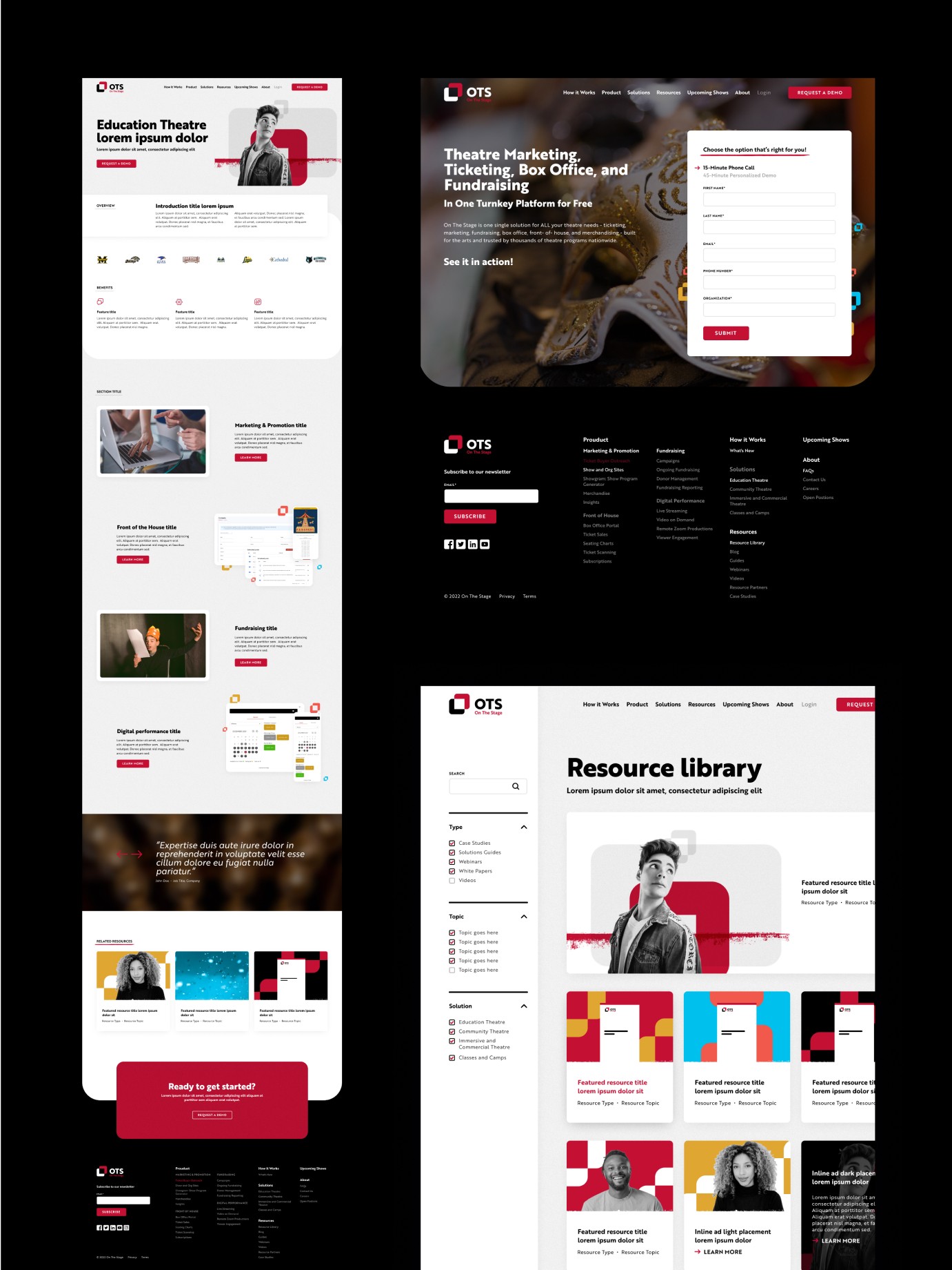
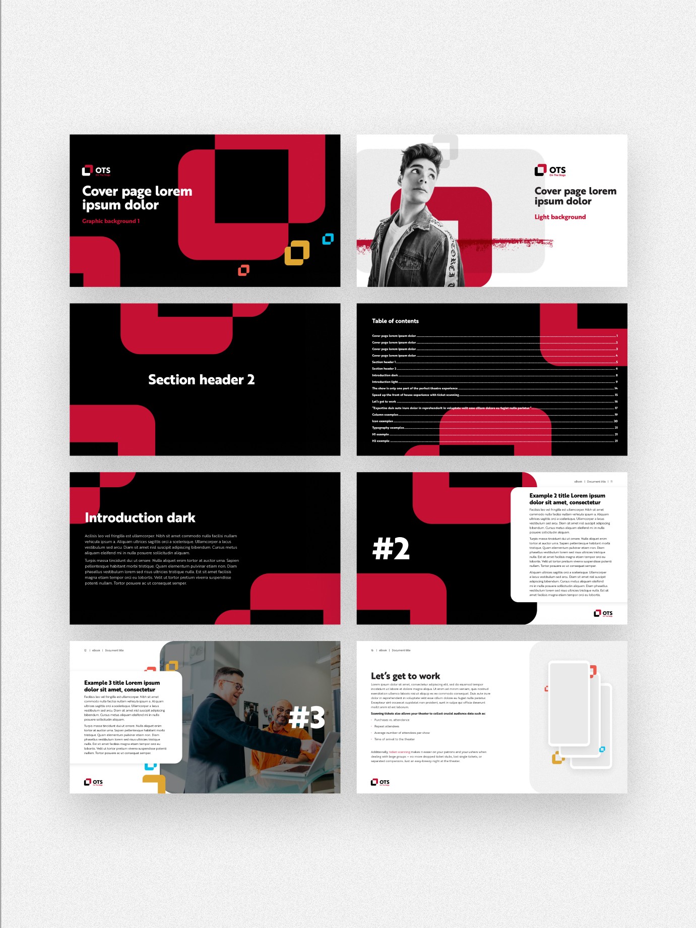
I built a bold, cohesive brand and website that captured the energy of the performing arts while communicating the professionalism of a software partner. A new logo and color palette anchored the identity, and a flexible system of 12 templates and 45 components carried it across 55 pages, up from 20.
The site launched in January 2023. Engaged sessions rose 55%, organic traffic grew 84%, new users increased 50%, and conversions rose 80%. Pages loaded 86% faster, and mobile traffic grew 38%.
On the Stage has continued to work with HUSL on social marketing, and we've begun a new website project with them.
Key decisions:
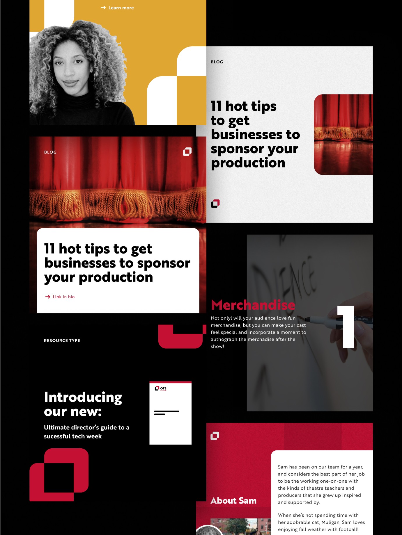
A brand that wasn't connecting: The existing identity felt youthful and didn't reflect the organizations it served. I created an entirely new identity, led by a new logo and color palette, with expressive typography and iconography that read as both creative and professional.
27 tools that were hard to grasp: Ticketing, marketing, fundraising, and add-ons all needed explaining. I organized the site around four categories and built 12 page templates and 45 components, so each tool has a consistent home. The site grew from 20 pages to 55.
Messaging that didn't hold together: The brand voice and content needed to match the new identity. I worked with a HUSL copywriter to unify the messaging, so words and visuals told the same story.
Credits
Art Direction, Brand, UX/UI
:
Brandon Swonger